
Designing a More Accessible Cultural Venue
About this practice test
Read about accessibility at a theatre, an arts hall's visitor information, and the planned layout of a community arts venue. Complete opinion, detail, cloze, diagram-labeling and inference tasks.
What you’ll practice
Finding detail
Locate specific information and evidence.
Interpreting ideas
Connect main points and inferences.
Evaluating arguments
Assess claims, evidence, and limitations.
What to expect:
18 questions with explanations to review after submission.
Study the questions and tasks
Work through the material below, or start the interactive practice above to complete an attempt. Try the exercises before opening any answer or transcript sections, then use them to review your work.
- Practice level
- B2. Try this level if you can follow the instructions and understand most of the language; choose an earlier level if you need more support.
- Question formats
- Yes / No / Not Given, Single choice, Fill in the blank (text), Fill in the blank (dropdown), Label the image
How to approach this practice
Read the passage for its main idea, then return to the relevant sentence or paragraph for each question. Base answers on the passage.
Beyond the Ramp
On a wet Thursday evening, I visited the old Orion Theatre with my friend Jonas, who uses a wheelchair. The building had a side lift, a printed accessibility leaflet, and three staff members who clearly wanted to help. Yet the experience still felt divided into 'ordinary guests' and 'special cases'. That is why I think cultural accessibility should be seen less as a box to tick and more as the shape of the whole visit. A ramp matters, of course, but so do the route to it, the tone of the welcome, the clarity of the signs, and the ease of buying a ticket without embarrassment. In the foyer, a manager proudly showed me a new app that could enlarge text, explain the programme, and list the nearest buses. Useful tools like this should not be dismissed. Still, I do not accept the common claim that digital support can replace human attention. Jonas could open the app, but he could not use it to ask a rushed cashier where the accessible toilet was. A venue is not truly open if a visitor has to solve every small problem alone. Nor is access improved when information exists only for people who already know what to look for. What impressed me most was a quiet matinee they had started for visitors who dislike crowds, bright lights, or sudden sound. The event was modest, not glamorous, but it widened the audience. I also liked that the venue invited local community groups to comment on seat spacing and sightlines before the renovation was finished. In my view, these changes are more useful than a single grand gesture because they answer real habits, not imagined ones. I do not mean that every venue must copy the theatre exactly. A museum, a concert hall, and a small cinema will need different solutions. The principle is the same: people should not have to prove they belong before they can enter. Some managers still say accessibility is expensive, and yes, some improvements cost money. But poor design also costs money when visitors stay away or leave early. A venue that waits until complaints arrive usually pays more for rushed fixes, because hurried solutions fit neither the building nor the people using it. Planning early is often cheaper than treating access as an afterthought. What matters is honesty about priorities. If the lift is in the back corridor, if the staff have never rehearsed how to guide someone calmly, or if the caption screen blocks half the stage, the venue has not finished the job. A cultural place becomes accessible when the welcome, the information, and the design work together. That is the standard I hope more institutions will adopt, not because it sounds generous, but because it is the only standard that respects the visitor as a full participant.
Checking the Riverside Arts Hall Information
At Riverside Arts Hall, Mara Singh, the visitor services coordinator, asked Omar Reid, a freelance accessibility tester, to examine the venue’s booking page and visitor information for a weekend exhibition. They wanted to see whether people could find key details without phoning. Omar worked through the site on a phone and a laptop, then compared it with a printed leaflet at the box office. He began by pretending to book three tickets for his sister, who uses a wheelchair, and his father, who reads slowly. As he clicked through each screen, he noted the wording, the contrast, and the contact options, because small design choices could affect whether someone kept going or gave up. The booking page gave a clear list of times, prices, and seating maps, but some practical points were hidden. The wheelchair spaces were marked on a separate plan, yet the page did not say that a companion ticket was free until the final step. The audio guide option was listed in the same typeface as the general ticket offers, so Omar had to look twice to spot it. He still liked one part of the page: the route from the bus stop to the entrance was explained in plain language, including the slope at the side door. What he missed, though, was a stronger heading for help with access, because the important links blended into the rest of the page. Next he checked the visitor leaflet at the box office. The leaflet repeated the opening hours and cloakroom rules, which made it easy to scan, but it missed the nearest quiet space and made no mention of step-free toilets. When Omar asked a staff member about this, she handed him an extra sheet with a map and a short note about seating for people who needed to stand and stretch. He thought that note was helpful, yet he also wrote that the sheet was easy to lose because it was not attached to the leaflet. A second line said, “If you need help, speak to any usher,” but it did not say what the usher could actually arrange. By the end of the test, Omar reported that the venue was better at giving directions than at explaining what support had to be arranged in advance. He suggested moving the ticket rules closer to the prices, using stronger headings, and adding the extra sheet to both the website and the printed materials. Mara said the comments were useful because they showed where visitors might give up before reaching the front desk. The team agreed to test the revised copy with older visitors and with people who had never used the venue before.
Mina and Tomas Design Lantern House
 region-1
region-2
region-3
region-4
region-5
region-6
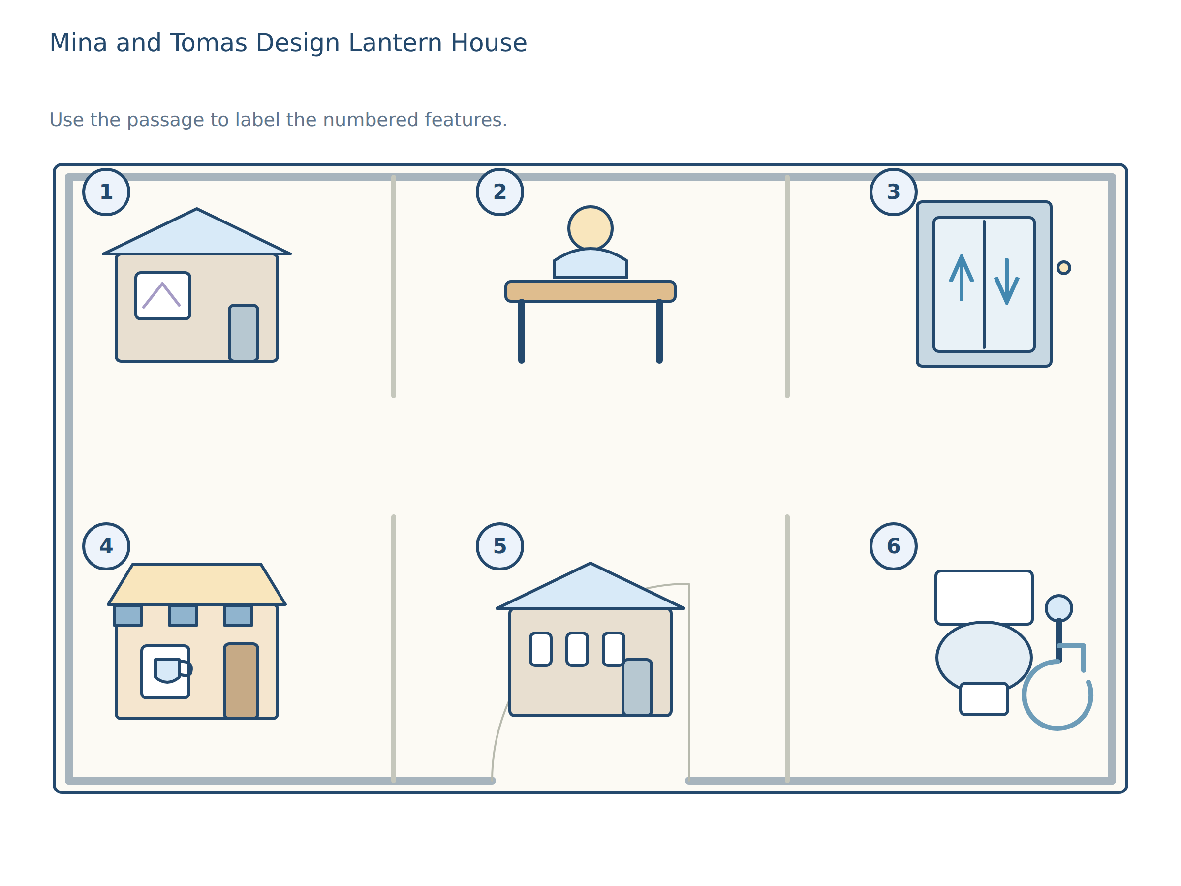
Mina Patel and Tomas Reed arrived early on a wet Tuesday to walk through the draft plan of their new community arts venue, Lantern House. The team had spread three planning sheets across the table, one for arrival, one for shared rooms and one for recovery spaces, because they wanted the building to work even when no event was on. It would host rehearsals, film nights, youth workshops and local exhibitions, but Mina said accessibility was not an extra feature added at the end; it was the logic behind the whole layout. "If people can move, wait, ask for help and leave without stress," she said, "they are more likely to come back." Tomas agreed, although he pointed out that the budget meant every good idea had to do more than one job. At the upper left is the quiet studio, a small room for one-to-one conversations, tutoring and sensory breaks. Mina placed it away from the busiest spaces because a calm room loses value if people have to pass through noise to reach it. In the upper centre is the reception desk, set low enough for wheelchair users and fitted with an induction loop. It faces the entrance, so visitors can get directions immediately instead of searching the building. The upper right holds the lift, which is wide enough for prams and wheelchairs and connects both floors without forcing people to use the stairs. On the lower left is the café and rest space, with moveable tables, a water point and enough open floor to let someone turn a chair without asking others to move. The lower centre is the main hall, the largest part of the plan. Its seating can be removed or rearranged, because the same room may need a dance platform one week and exhibition walls the next. Tomas liked this flexibility, but he also accepted its limits: a flexible room cannot be perfectly silent, and the team had to promise good sound management rather than complete acoustic isolation. At the lower right is the accessible toilet, fitted with a fold-down rail and an alarm cord. Mina insisted on placing it close to the main hall, because a facility that is technically available but awkward to reach does not feel inclusive in practice. The final plan is not trying to prove that design alone can solve every barrier. Instead, it shows how small decisions add up: a low desk reduces anxiety, a nearby lift saves energy, a quiet studio gives people somewhere to recover, and a clearly placed toilet supports independence. Tomas described the venue as "a building that starts by expecting different bodies and different paces." That, more than any single feature, is what makes the scheme accessible.
-
Question 1 · Yes / No / Not Given
Decide whether the statement agrees with the writer’s or speaker’s view. Choose Not Given when the view is not stated.
The writer believes a quiet matinee can help a venue reach more people.
Return to the passage, recording or visual- Yes
- No
- Not Given
Check answers and explanations
- Answer
- Yes
Yes. The writer says the quiet matinee was designed for people who dislike crowds, bright lights, or sudden sound, and states that it widened the audience. That supports the view in the statement.
What impressed me most was a quiet matinee they had started for visitors who dislike crowds, bright lights, or sudden sound
The event was modest, not glamorous, but it widened the audience
Yes: Correct. The writer says the quiet matinee widened the audience.
No: This is the opposite of what the writer says; the matinee is presented as broadening access.
Not Given: The text directly states the result, so this is not unstated.
-
Question 2 · Yes / No / Not Given
Decide whether the statement agrees with the writer’s or speaker’s view. Choose Not Given when the view is not stated.
The writer believes accessibility should be judged only by whether a building has the correct physical equipment.
Return to the passage, recording or visual- Yes
- No
- Not Given
Check answers and explanations
- Answer
- No
No. The writer says a ramp is only one part of access and adds that the route, welcome, signs and ticketing also matter. That directly rejects the idea that physical equipment alone is enough.
A ramp matters, of course, but so do the route to it, the tone of the welcome, the clarity of the signs, and the ease of buying a ticket without embarrassment
cultural accessibility should be seen less as a box to tick and more as the shape of the whole visit
Yes: This would mean physical equipment is the only measure, but the writer says several other factors matter too.
No: Correct. The writer clearly argues that access includes welcome, information and ease of use, not just equipment.
Not Given: The passage does discuss physical access, so the claim is addressed and rejected rather than left unstated.
-
Question 3 · Yes / No / Not Given
Decide whether the statement agrees with the writer’s or speaker’s view. Choose Not Given when the view is not stated.
The writer believes people should not have to prove they belong before they can enter a cultural venue.
Return to the passage, recording or visual- Yes
- No
- Not Given
Check answers and explanations
- Answer
- Yes
Yes. The writer states this principle directly. It is one of the clearest opinions in the passage and is presented as the right standard for venues.
The principle is the same: people should not have to prove they belong before they can enter
Yes: Correct. This sentence states the writer's view almost exactly.
No: This conflicts with the writer's explicit principle of inclusion.
Not Given: The idea is stated directly, so it is not left unstated.
-
Question 4 · Yes / No / Not Given
Decide whether the statement agrees with the writer’s or speaker’s view. Choose Not Given when the view is not stated.
The writer believes government grants are the only practical source of money for accessibility work.
Return to the passage, recording or visual- Yes
- No
- Not Given
Check answers and explanations
- Answer
- Not Given
Not Given. The passage mentions that improvements cost money, but it never says where that money must come from. It does not discuss government grants as the only or even the main source of funding.
Some managers still say accessibility is expensive, and yes, some improvements cost money
What matters is honesty about priorities
Yes: The passage never says this, so it cannot be confirmed.
No: The writer does not reject grants as a source; the issue is simply not discussed.
Not Given: Correct. Funding sources are not specified, so the claim cannot be checked from the text.
-
Question 5 · Yes / No / Not Given
Decide whether the statement agrees with the writer’s or speaker’s view. Choose Not Given when the view is not stated.
The writer thinks a venue's app can replace staff when visitors need help.
Return to the passage, recording or visual- Yes
- No
- Not Given
Check answers and explanations
- Answer
- No
No. The writer calls the app useful, but says it cannot replace human attention or solve every practical problem at the venue. The opinion is explicitly rejected.
I do not accept the common claim that digital support can replace human attention
Jonas could open the app, but he could not use it to ask a rushed cashier where the accessible toilet was
Yes: The writer does not support this. The app is described as useful, but not as a substitute for staff.
No: Correct. The writer directly rejects the idea that digital support can replace human help.
Not Given: The passage gives a clear opinion about this, so it is not left unstated.
-
Question 6 · Single choice
Choose one answer.
What is the writer's main argument in the passage?
Return to the passage, recording or visual- Digital tools should replace most staff guidance for disabled visitors.
- Accessibility should mainly attract larger audiences, rather than respect visitors.
- Meaningful accessibility improvements are possible only in large cultural venues.
- Accessibility should shape the whole visit, not just one feature.
Check answers and explanations
- Answer
- Accessibility should shape the whole visit, not just one feature.
The correct answer is that accessibility should shape the whole visit, not just the entrance or one feature. The passage repeatedly expands the idea of access to include staff behaviour, information, design and the visitor's sense of belonging. The other options are contradicted or too narrow.
cultural accessibility should be seen less as a box to tick and more as the shape of the whole visit
A cultural place becomes accessible when the welcome, the information, and the design work together
-
Question 7 · Fill in the blank (text)
Complete each blank with the missing word or phrase.
Write NO MORE THAN ONE WORD AND/OR A NUMBER from the passage. They wanted to see whether people could find key details without ___.
Return to the passage, recording or visualCheck answers and explanations
- Blank 1
- phoning
Phoning is the exact action named in the passage. Words like "calling" or "visiting the desk" are not what the text says.
They wanted to see whether people could find key details without phoning
-
Question 8 · Fill in the blank (text)
Complete each blank with the missing word or phrase.
Write NO MORE THAN ONE WORD AND/OR A NUMBER from the passage. The page did not say that a companion ticket was free until the ___ step.
Return to the passage, recording or visualCheck answers and explanations
- Blank 1
- final
Final is correct because the passage says the information appeared only at the last stage. "First" or "later" would contradict that timing.
the page did not say that a companion ticket was free until the final step
-
Question 9 · Fill in the blank (text)
Complete each blank with the missing word or phrase.
Write NO MORE THAN TWO WORDS AND/OR A NUMBER from the passage. The leaflet missed the nearest ___.
Return to the passage, recording or visualCheck answers and explanations
- Blank 1
- quiet space
Quiet space is the missing item named in the leaflet section. Other nearby ideas, such as step-free toilets, are separate details and do not complete this sentence.
it missed the nearest quiet space and made no mention of step-free toilets
-
Question 10 · Fill in the blank (dropdown)
Choose the correct option for each blank.
The route information included the ___ at the side door.
Return to the passage, recording or visualChoices for blank 1
- corridor
- staircase
- lift
- slope
Check answers and explanations
- Blank 1
- slope
Slope is correct because the passage says the route was explained "including the slope at the side door." The other choices are not mentioned in that description.
including the slope at the side door
-
Question 11 · Fill in the blank (dropdown)
Choose the correct option for each blank.
Omar said the extra sheet was easy to lose because it was not ___ to the leaflet.
Return to the passage, recording or visualChoices for blank 1
- attached
- printed
- translated
- summarised
Check answers and explanations
- Blank 1
- attached
Attached is correct because Omar wrote that the sheet was "not attached to the leaflet." The other options do not fit the reason he gave.
it was not attached to the leaflet
-
Question 12 · Fill in the blank (dropdown)
Choose the correct option for each blank.
Mara said the comments were useful because they showed where visitors might give up before reaching the ___.
Return to the passage, recording or visualChoices for blank 1
- entrance
- front desk
- cloakroom
- box office
Check answers and explanations
- Blank 1
- front desk
Front desk is correct because the passage says the comments showed where visitors might give up before reaching the front desk. The other options are places mentioned elsewhere or plausible but unsupported alternatives.
they showed where visitors might give up before reaching the front desk
-
Question 13 · Label the image
Match the labels to the marked regions of the image.
Read the passage and choose labels for the six parts of the diagram.
Return to the passage, recording or visualImage labels
lift · café and rest space · main hall · accessible toilet · ticket kiosk · cloakroom · quiet studio · reception desk
Label regions region-1, region-2, region-3, region-4, region-5, region-6 marked on the image above.
Check answers and explanations
- Region region-1
- quiet studio
- Region region-2
- reception desk
- Region region-3
- lift
- Region region-4
- café and rest space
- Region region-5
- main hall
- Region region-6
- accessible toilet
Label 1: quiet studio — it is in the upper left and supports conversations, tutoring and sensory breaks. Label 2: reception desk — it is in the upper centre, faces the entrance and provides immediate directions. Label 3: lift — it is in the upper right and connects both floors. Label 4: café and rest space — it is in the lower left and has moveable tables, a water point and open floor. Label 5: main hall — it is in the lower centre and has removable or rearrangeable seating. Label 6: accessible toilet — it is in the lower right, near the main hall, with a fold-down rail and alarm cord.
At the upper left is the quiet studio, a small room for one-to-one conversations, tutoring and sensory breaks
In the upper centre is the reception desk, set low enough for wheelchair users and fitted with an induction loop
At the lower right is the accessible toilet, fitted with a fold-down rail and an alarm cord
-
Question 14 · Single choice
Choose one answer.
Why did Mina place the quiet studio away from the busiest spaces?
Return to the passage, recording or visual- To reserve the main hall for exhibitions.
- To keep it beside the café and rest space.
- To make it the first room visitors see.
- To keep the room calm for conversation and sensory breaks.
Check answers and explanations
- Answer
- To keep the room calm for conversation and sensory breaks.
She wanted the room to stay calm for conversations, tutoring and sensory breaks. The passage says the room loses value if people must pass through noise to reach it. The other options ignore this reason or add ideas not supported by the text.
Mina placed it away from the busiest spaces because a calm room loses value if people have to pass through noise to reach it
a small room for one-to-one conversations, tutoring and sensory breaks
-
Question 15 · Single choice
Choose one answer.
What does the reception desk’s design mainly show about the venue?
Return to the passage, recording or visual- It mainly stores equipment securely.
- It occupies the cheapest available position.
- It is hidden so visitors explore first.
- It gives visitors quick, comfortable help.
Check answers and explanations
- Answer
- It gives visitors quick, comfortable help.
The low desk, induction loop and position near the entrance show that the venue wants visitors to get help quickly and comfortably. It is not mainly about selling tickets or making people search the building.
In the upper centre is the reception desk, set low enough for wheelchair users and fitted with an induction loop
It faces the entrance, so visitors can get directions immediately instead of searching the building
-
Question 16 · Single choice
Choose one answer.
What does the writer imply about the main hall?
Return to the passage, recording or visual- It is separated from every other space.
- It is suitable only for dance performances.
- It guarantees silence for every event.
- It is flexible but still needs sound management.
Check answers and explanations
- Answer
- It is flexible but still needs sound management.
The hall is useful because it can change shape for different events, but that flexibility has limits. The text says it cannot be perfectly silent, so the team must manage sound rather than expect a perfect solution.
Its seating can be removed or rearranged, because the same room may need a dance platform one week and exhibition walls the next
a flexible room cannot be perfectly silent, and the team had to promise good sound management rather than complete acoustic isolation
-
Question 17 · Single choice
Choose one answer.
Why does Mina insist that the accessible toilet be close to the main hall?
Return to the passage, recording or visual- Because difficult-to-reach facilities do not feel inclusive.
- Because it is used only during exhibitions.
- Because it must be the building's quietest room.
- Because the hall needs storage beside it.
Check answers and explanations
- Answer
- Because difficult-to-reach facilities do not feel inclusive.
Mina believes that access only counts if it is easy to reach in practice. The text says a facility can be technically available yet still not feel inclusive if it is awkward to reach.
Mina insisted on placing it close to the main hall
a facility that is technically available but awkward to reach does not feel inclusive in practice
-
Question 18 · Single choice
Choose one answer.
What is the main purpose of the final paragraph?
Return to the passage, recording or visual- To show how small design choices build accessibility.
- To announce that the venue has opened publicly.
- To compare Lantern House with other arts centres.
- To explain the building's construction a century ago.
Check answers and explanations
- Answer
- To show how small design choices build accessibility.
The closing paragraph sums up the writer’s argument: accessibility comes from many small decisions working together, not from one impressive feature alone. The paragraph does not claim the building is finished, compare it with others, or give its history.
The final plan is not trying to prove that design alone can solve every barrier
Instead, it shows how small decisions add up
What to review next
Find the words that support each answer. For a mistake, compare the question with the evidence and identify the detail or inference you missed.
A focused practice result shows how you did on these tasks. Use several activities across skills to decide what to study next; one practice score does not certify an overall CEFR level.
Before you practise: a worked example
Look for evidence in the text. Separate what the writer says from what you already know about the topic.
The library normally closes at six, but on Fridays it stays open until eight. When does it close on Friday?
The answer is eight. But introduces an exception to the normal closing time, so the first time mentioned is not the answer.
This teaching example is separate from the scored questions. After your test, compare any mistakes with the explanation and revisit the topic before trying again.